

When experimenting with messaging, a lot of the focus is on the message content itself: what you want to say to your customers (at Aampe we call them contacts) and how you want to say it. In most marketing automation systems, the question of when you message is often taken as something you already know. You can decide to send a message on Tuesday afternoon, or three days after the initial message was sent, or one day after the contact opened the message, etc. All of those details are themselves very experiment-able: sending the right message at the wrong time is just as ineffective as sending the wrong message at the right time.
At Aampe, one of the first things we help our customers do is experiment with message timing.
The problem is, message timing is a really large and complicated landscape to explore. If you assume that you can message any contact on any day of the week and any time of day, and divide the day into three parts - morning, mid-day, and evening, you have 21 options to explore. If, as many of our customers do, you want to message in response to some previous action, like a link click or a purchase, you have additional options to explore (say you’re open to re-messaging anywhere from one through seven days after the event - that’s seven more options). Say you’re open to reminding people anywhere up to three times. That’s three more options. Now consider all of the intersections: what if a reminder 24 hours after an event is at 2:00 in the morning on a Sunday? If they don’t respond, is that because 24 hours is a bad reminder time for them or because early Sunday mornings is a bad time in general for them? You can see how the options (and confusion) proliferate.
We can use experiments to explore all these options, but by forming some reasonable assumptions before we ever run an experiment, we can explore the timing landscape more efficiently and move on to exploitation of findings - and the profit and growth that comes from that - in much less time.
This post explains how we use historical transaction data to do that.
Get some data
For this post, I’m going to use some e-commerce data from Kaggle. The dataset contains four fields that matter to us:
- user_id. Self-explanatory.
- event_time. Using the event time allows us to find the time of day and day of week that each contact did something on the platform.
- event_type. Because this is an e-commerce platform, the event types are things like “view”, “add to cart”, and “purchase”. These are important to us because they represent a funnel: an add to cart is more valuable to the customer than a view, and a purchase is more valuable than an add to cart. This part isn’t strictly necessary, but it helps.
There are other fields in the dataset like user_session, product_id, category_id, category_code, brand, and price, but those aren’t important to us for this present task (with one possible exception, which I’ll address at the end of the post).
Score the funnel
Imagine someone who tends to visit a site during work hours but doesn’t make purchases until they come home from work. If we’re trying to reach them at a time when they are likely to purchase, we don’t necessarily want to message them at the times when they log the most visits to the site. That kind of logic will often hold true for e-commerce situations, but might not for others. If we want to message someone closest to the times when they are likely to engage in the most valuable funnel actions, then we want to score the funnel so more valuable actions can count for more in our analysis. If we have a different messaging logic in mind, we might manually impose specific weights or weight every event the same.
We can infer how valuable a funnel action is by observing how common it is. In the table below, we can see that for a random sample of around 10,000 events, the grand majority were views. Less than 4% were adds to cart, and a little over 1% were purchases. We can calculate a weight for each funnel event by dividing the event count by the maximum across all events, and then taking the inverse - so the most common event will have a weight of 1, and everything else will have a weight greater than or equal to one.
If we use the raw counts, views will have a weight of 1, adds to cart will be worth 27 times more than a view, and purchases will be worth 65 times more than a view. To me, that seems a little excessive, but it might not be depending on our customer’s perspective about what matters to their business. I also show the number of events and corresponding weights under a log and a square root transformation. I use the square root transformation as a default.

The above weights allow us to summarize each individual contact’s overall activity so that more important actions count for more.
Estimate action probabilities
When running experiments, Aampe assigns every contact a score indicating the probability that they will act, given their exposure to a particular treatment in an experiment. We want to turn our transaction data into a score that can be interpreted similarly, but without having to run an experiment first. That means two things need to be true:
- We need a score that can be interpreted as “probability to act”.
- We need to be conservative about assigning high scores because we’re only dealing with historical data, not experimental data.
The beta-binomial distribution is a good tool for this. You can find a good technical explanation of the beta-binomial here, and a slightly more human-friendly explanation here. What you’ll find in this post is an explanation so human-friendly that it’s not technically correct, but is hopefully correct enough to impart a decent intuition about how we’re using the distribution.
We’re interested in using the distribution to get a cumulative distribution function (CDF). The CDF takes a value and tells you the percentage of values in a distribution that you can expect to fall below the given value, given that the distribution is of the type and parameterization you say it is. The beta-binomial distribution assumes that you’re dealing in binary outcomes: wins vs. losses, or in our case, action vs. inaction. If you had a bunch of historical outcomes, you could easily calculate metrics like “what’s the probability that this customer will act given that we give them 57 opportunities to do so.”
Obviously, the more opportunities you give a contact to act, the higher the probability that they’ll do so at least once. But we don’t have a bunch of historical outcomes for most customers - sometimes we have only a few, and we can’t feel confident that those represent all of the opportunities they’ve had to act. That’s where the beta-binomial distribution comes in. To define the distribution, we need to specify three parameters: n, ɑ, and β. Think of n as “the number of opportunities we’ve given a customer to act”, ɑ as “the number of times they have acted”, and β as “the number of times they didn’t act.” (This is what I meant by “so-human friendly that it’s not technically correct.” The parameters don’t actually mean these things, and each parameter can take a wide wide array of values that can’t be interpreted in this way at all. But in our particular case, if we act as if the parameters meant these things, we get a heuristic that works for us).
So if we sum our funnel weights for every hour of day and every day of week, we get a bunch of sums representing the number of “wins” - a heuristic representation of how much a contact acted within that time slot. Take the maximum of those values and treat that as n. Subtract the average value from that maximum and treat that as ɑ. Treat the mean itself as β. Now calculate the CDF for each slot’s value. What we get is a score that can be interpreted as “given all the other times we’ve seen them act, and the amount of actions we’ve seen at that time, what’s the probability that this contact acts within this time slot?”
The plots below show you how this works for a handful of contacts. Each contact had scores for 100 time slots, but as you can see, those 100 data points looked quite different for each contact. The horizontal axis is the total funnel weight per time slot. The dots represent the values from the beta-binomial CDF for each weight. The line represents the cumulative percentage of weight at each point.
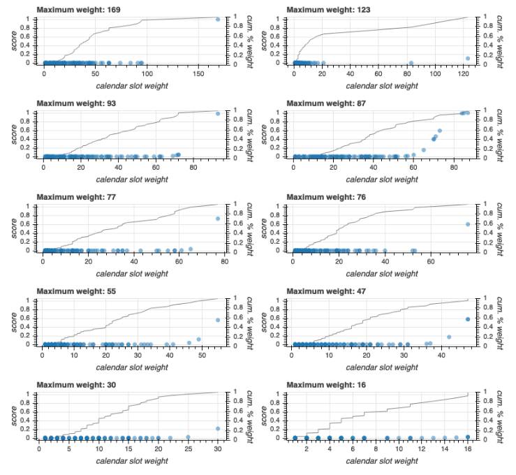
The lower that maximum value, the less chance it has to get a high absolute score, even though it will be the highest of all the scores for that contact. For example, notice the contact in the bottom-right corner had a maximum weight of 16. That means that in one time slot, they had 16 views, or around 3 adds to cart, or two purchases, or some combination of the three. And notice that they had a lot of other time slots that were very close to that - the cumulative percent weight line almost forms a diagonal across the plot. There’s just not much signal there to form an opinion about that contact’s timing preferences.
Now look at the contact in the top-left corner. The maximum absolute weight is very high, and that weight not surprisingly corresponds to an action probability near 1.0. But notice that that same contact has several slots with weight above the maximum weight of the first contact we considered. Those all get probabilities near 0.0 because the CDF takes into account both the value and it’s position within the distribution.
So now we have a score for every contact for every time slot in which we’ve seen visitation. With a little rounding, we can also get a default minimum value to fill in the remainder of the slots (we use a value of 0.00001).
Do a sanity check
Let’s take a look at how these results fall out when we consider, not just a handful of individual contacts, but all records for all contacts.
The following plot shows the extent to which each individual time slot’s funnel weight corresponds to the score that we assigned based on the beta-binomial CDF:

Biggest dots indicate a greater number of records. As you can see, it’s difficult for a time slot funnel weight of less than 10 to get a score higher than 0.2. Also, there are a great many time slots that have a high weight - between 100 and 1000, yet still get a negligible score. That’s because those distributions included time slots that had still higher weights, and therefore were assigned higher scores.
The following graph shows the distribution of maximum scores - across all days and times - assigned to each contact:

The horizontal axis shows the maximum probability estimate for each contact, and the vertical axis shows, on a logarithmic scale, the cumulative percentage of all contacts. I’ve annotated a few points along the curve to illustrate the distribution. About 1.4% of all contacts have a score above 0.9; about 7% of all contacts have a score above 1%; around 22% of all contacts have a score above 0.1; and over 44% have a score above 0.01. In other words, the grand majority of contacts have very small scores, but a substantial minority have larger scores - some very much larger. That meets our dual purposes of forming reasonable prior assumptions about when contacts are most likely to act, while not easily allowing those assumptions to override our most basic assumption: that we really should try to figure all of this out through experimentation.
The above process allows us to switch a large number of contacts (which, nevertheless makes up a small percentage of the total contacts) from exploration to exploitation right from the start. The more confident we are about when a contact is active, the less chance our system will have their timing experimented with.
Form personalized recommendations
It’s easy to use these scores to make some generalizations about active times across the entire contact base represented in the data set. For example, here is a global view of the timing:

The left graph shows the number of contacts seen, and the right graph shows average scores. In each graph, each row represents the hour of the day and each column represents the day of the week (1 is a Monday). The darker blue the time slot, the fewer contacts seen or the smaller the average score. As those numbers go up, the color changes to yellow and eventually to red.
So we can see that the site got more activity on the weekends during the day, less activity on weekday days, and the least activity on late evenings and early mornings. That all seems like common sense. However, when we look at average scores, we see that the evening visitors were much more active even though they were fewer in number. In fact, Thursday evening seems to be something of a hotspot of this site. Also, even though the site got a lot of visitors on weekdays during the daytime, those time slots were the least active times for those visitors.
And this is what those same heatmaps look like when we only consider time slots where we were very confident about our contacts’ timing - cases where we had scores above 0.5:

The overall visitation patterns for these contacts look similar to the average activity patterns for the total set of contacts we viewed above - most visits on weekends, fewer visits on weekdays, and fewest visits at nights. Notice, however, that the activity pattern for these visitors is much more evenly spread out across all time slots. Among those contacts where we got a confident estimate, there was much more variation in timing preference.
In other words, if we messaged contacts at times when all contacts were, on average, active - or even worse, if we messaged at times when the greatest number of contacts came to the site - we’d be messaging at the wrong time for a great many contacts. While the heatmaps look neat, the real insight here is the one that’s hard to visualize - the personalized score for each individual contact that tells us when they are most likely to act.
Other applications
We can take the above approach for more than just absolute timing. This shows scores for number of hours that elapse between actions:

I calculated scores separately for multi-day (>24 hours) elapses and within-day (<= 24 hours) elapses. Unsurprisingly, for within-day elapses, the greatest number of event sequences as well as those with the highest average scores occur with events that take place within one hour of one another. Multi-day events also tend to score highest at the smaller numbers, with scores dropping off pretty dramatically after around 800 hours (about one month).
We can use the same process to look at offering preferences - in the case of the Kaggle dataset, these are product categories (such as “electronics” or “clothing”):

The categories are rank-ordered in the plot. Notice several places where the grey line, indicating the number of contacts who visited that category, are extremely low compared with those around them. Those are cases where a category got less overall traffic compared to other categories, but where the visitors the category did get were more likely to act.
Never forget these are priors
Especially when applied to the relative timing and category preferences illustrated in the previous section, it’s important to recognize the limitations of any approach that tries to make decisions based on historical data. Each of these patterns is the result of a particular data-generating process. In the case of day and time preferences, we might not expect to influence that data-generating process too much - if someone only tends to visit our site on Thursday or Friday evenings, there’s not a whole lot of point to trying to get them to switch to Monday mornings. At best, we’d just succeed in getting them to shuffle their value around without actually increasing it. At worst, we’d lose what value they offer because we’d try to get them to do things in a window that simply isn’t available to them to do the things we want them to do.
The data-generating process may be different for relative timing. A contact may only come to the site once every two weeks. If we can get them to come to the site once every week, that has the potential to double the value they offer us. Why don’t they come once every week already? It may be because they only need to buy someone that our site offers every two weeks, or it may be they only buy things after pay day. Or it may be they simply haven’t been given a good reason to come more often than that. We shouldn’t assume that if they are a one-every-two-weeks customer, that that’s simply what they will always be. That interval provides us with a good starting point, but that’s all it does.
The same thing is true of product preferences. Just because a customer has been interested in a particular offering over the last two months doesn’t mean they will be interested next month. This is the poverty of machine learning: assuming that what you have done is what you will continue to do. If a customer buys groceries, it’s probably safe to assume they will buy them again soon, even if they don’t buy them from us. If they buy a large piece of consumer electronics such as a laptop or a television, it’s probably safer to assume that they won’t buy another for at least several months - perhaps several years.
In all cases, these scores provide us with some specific, important, but limited value: they give us a head start in our search for the best way for our customers to reach their contacts. For a message to invite someone to action, it has to reach them in the right way at the right time about the right thing. We can start that search blind, and gain our sight progressively as experiments yield information about customer actions and preferences. With these scores, we don’t have to start blind. Our learning can happen faster, so our customers can grow faster.


