
We’ve written a lot about how important timing is in sending push notifications (see here and here, for example), and we’ve also written about how you can get smart about what copy you write, but one theme we haven’t touched on (until now!) is the actual focus or topic of the message.
Every app is a content app.
If you stream videos, then the videos are your app’s content.
If you sell clothes, then the clothes (and the reviews and measurements and ratings and sizes and colors that describe those clothes) are your app’s content.
If you deliver food, then the restaurants, recipes, ingredients and reviews are your content as well.
At the most basic level, you’re trying to get your users to engage with that content, and messaging is perhaps the most important way you can go about doing that.
Aampe helps you deliver the right copy at the right time...but what about the actual content?
Most apps — especially e-commerce apps — have all kinds of ways of organizing their inventory within their user interface…
…and this is a double-edged sword.
On the one hand, it’s great to have multiple ways to get from the app’s home screen to any particular piece of content — you users are all different, so you shouldn’t expect them to all take the same path.
On the other hand, the sheer number of alternative paths is one of the major challenges of any app’s user experience (think of the last time you scrolled through Netflix’s lists of lists and finally gave up on finding something to watch because there were too many options to choose from).
Aampe helps rescue your user from this maze of paths and options, by learning the content that each user is interested in and sending it directly to their home screen via push notifications.
But that leaves us with a problem: How in the world can we learn which topics a user likes, when that topic information is organized a dozen different ways in the app itself?
Graph traversal. And some natural language processing. (Don’t worry: it’s hard to do, but not hard to understand.)
Let’s walk through it.
The techie bit
Most app content is stored under complicated paths. Here’s a list of the full inventory for one our customers, which focuses on home goods:
Each row is a path a user can follow in the app. So they could go from “Home Accessories” to “Wallpaper” to “Wall Decals”, or from “Furniture” to “Seating” to “Bar stools, and so on.
In all, there are 283 different paths allowing users to access over 250,000 different inventory items!
Some of these paths leads to a whole lot of inventory (the “Wall Art -> Art Prints” path alone leads to nearly 10,000 different items), whereas some paths (like “Home Accessories -> Cushions and Beanbags -> Cushion covers”) leads to only one item. Each bar in the graph shows how many items each path leads to.
A path to individual inventory items works within a UI, but that kind of semi-structured data makes it hard to learn what about the path worked for the user. For example, if you want picture frames, you can find them via the “Home Accessories -> Frames”, or the “Wall art -> Frames” path, or the “Lifestyle & Gifts -> Frames” path, or by just looking in the top-level “Frames” category. It’s hard to decide what lesson to take away from a user following any one of those paths rather than the others.
We break this content into categories
We can make this a little simpler by simplifying the categories.
For example, our e-commerce customers who sell clothing practically always have categories that represent their prospective buyers: “Men’s Shoes”, “Kids Pants”, “Women’s Shirts”, etc.
They aren’t selling men, kids and women — They’re selling shoes, pants, and shirts.
The prospective buyer of an item is important information (We’ll talk about how we extract and use that information in a future post), but for the time being, we’re really only interested in the stuff people can buy.
We use language to understand your base offering and simplify those ‘paths’
Luckily, language has structure, and we can use that structure to separate the actual stuff from the descriptions of the stuff.
For example, consider the home goods category “End and Side Tables”. Aside from the word “and”, all of the words in that category, individually, are nouns - they indicate things. However, because of the way those words are ordered, we can know that the app isn’t selling ends and isn’t selling sides. It’s selling tables:

(This is some pretty basic natural language processing known as “dependency parsing,” and it allows us to go through all of those category paths and turn end tables into tables, picture frames into frames, and wall art into art.)
This makes our job easier, but there’s still more to do. This is what that “simplified” view of the inventory looks like:

The blue dots are the root words in each inventory category (e.g the “table” in “end tables”)
They gray dots are the descriptors (e.g. the “end” in “end tables”), which we can lay aside for the moment.
The lines are relationships between categories.
The very middle blue dot isn’t actually an inventory category…think of it as the entrance to the inventory maze.
Including that entry point in the graph is what allows us to organize all the rest of the rings. For example:
The innermost ring contains all of the categories that tend to be nearer to the beginning of the paths rather than the middle or the end. It includes categories like “accessories”, “tech”, “art”, “furniture” and so forth.
The next ring out includes mid-level categories (“bag”, “storage”, “pot”, etc.) as well as a bunch of descriptive words (“gift”, “outdoor”, etc.) that were connected to the top-level categories.
The third ring contains a few legitimate categories, but is mostly descriptive words.
The last ring out is entirely descriptive words.
Notice how all the dots in the first and second rings are all connected to each other — all of that interconnectedness is what we’re trying to manage, and we can use this layered ring structure in the inventory to do that.
First, we just drop out all the descriptive words.
Then, we remove all connections that move toward the center of the ring rather than away from the center (In other words, we want to see dots on the first ring connecting to dots on the second ring, but we don’t want to see any dots on the second ring connecting to dots on the first ring).
Finally, go through and clean up the last instances of multiple connections between dots. (So if two second-level dots connect to the same third-level dot, pick one of those second-level dots to own it. We won’t go into how we do this tie-breaking here — it involves moving up and down the network and seeing how the structure would change if we picked one winner instead of another).
What we end up with is this:
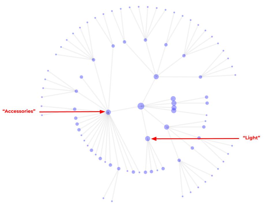
Ahhh…that feels better, doesn’t it?
To be clear, we haven’t removed category information — we’ve just restructured it.
The center dot still represents the inventory as a whole, and once again the first ring represents the most important categories.
Some, like the “accessories” node on the left side of the image, branch out into a whole bunch of sub categories, and some of those branch into even smaller categories.
Others, like the “light” category at the bottom of the first ring, branch only into a handful of other categories (lamps, arm lamps, lamp shades, and lighting fixtures).
Here’s what all of this simplification allows Aampe to do:
It gives us categories to learn on
Remember how we divide the days of the week into time slots and learn which times and days each user likes to get messages?
In a similar manner, we can divide the product inventory into categories and learn which categories interest which users.
We can identify new, previously undiscovered user preferences
Because these categories are nested, we can actually learn preferences for categories that we don’t explicitly message about.
For example, if a user responds positively to a message about lamp shades, our system will not only learn that they’re interested in lamp shades, but it will also learn that they’re interested in lighting in general (although the system will be more confident about the lampshade preference than it is about the general lighting preference).
New app learning, same app structure
Perhaps most importantly, Aampe doesn’t require our customers to do any of this structuring themselves.
You can come with your existing super messy and complex networks of inventory category paths, and we transform them into learnable, nested categories automatically.
All you need to bring is your inventory. Aampe does the rest.
Want to make it easier for your customers to find the products that interest them most? Drop us a note at hello@Aampe.com!


