There are plenty of tools that help you benchmark your ads against your competitors, but how do you compare your customer experience after your user clicks?
How many push notifications should I send per day?
What time should I send my push notifications?
What should my onboarding journey look like?
Of course these answers vary by app and by industry (...and, we would argue, by user), but logging SMS messages and push notifications from the competitors in your field can give you an objective, traceable, and trackable benchmark that you can use to get started.
First of all, you're going to need to enable notification logging
I've already written about that here, and here's a video to get you started.
It's free and takes less than five minutes to set up:

First, we need to do a little housekeeping.
Here's what I do.
I first split the time and date column into a "date" and a "time" column, so I can look at each independently.
For "date", I put this formula in cell B2 and drag it down:
=LEFT(A2,17)
For "time," I put this formula in cell C2 and drag it down:
=Right (A2,7)
(You can then change the format to "time.")
I also classify each app by industry. More on that in the video at the bottom of this page.
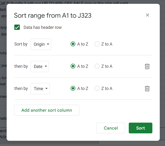
Finally, I sort the table by App ("Origin"), then by Date, then by Time
Now I have an orderly list of each push notification that each app sent in chronological order:

Review messages and look for patterns
Once you've done this, you'll already be surprised at the patterns you're likely to find.
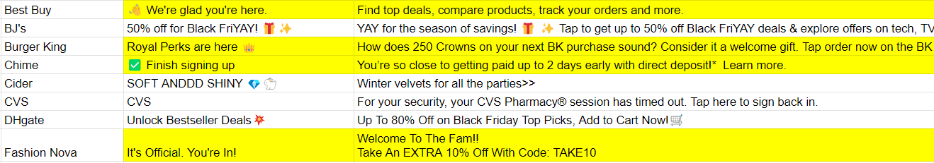
For example, you can which apps send you welcome or onboarding messages and which don't:
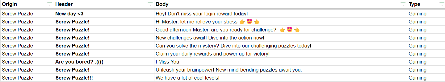
Or, look how Screw Puzzle uses "Screw Puzzle!" for almost every message header.
This is pretty common, but it's a practice that often causes dwindling user engagement because of the habituation effect (When you write the same thing over and over again, users tend to tune it out):
Or notice how Temu sends the same exact "just restocked" message every ~two days:

You can also put this data into a pivot table to see things like how many notifications each app sends per day
Notice how Harbor Freight sends one message almost every day:

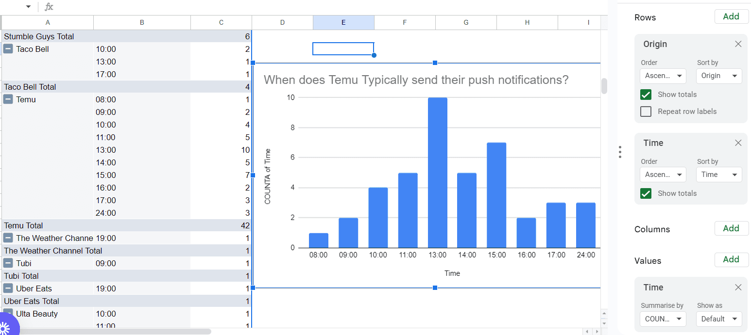
Changing the filters to look at time, you can make a quick chart of what times per day each app typically sends its messages:
Look for specific info across your message library
Finally, you can look for specific things throughout your entire message library.
For example, I use the following formula to look for a "%" in either the message header or body as a proxy for a discount message:
=IF(OR(ISNUMBER(SEARCHB("%",[HEADER CELL]))=TRUE,ISNUMBER(SEARCHB("%",[BODY CELL]))=TRUE),1,"")
Note: Swap the "%" for whatever words or characters you're looking for and swap the "[HEADER CELL]" and "[BODY CELL]" for the actual cell numbers (like "B2" and "C2").
Now, if you add up that row, it will tell you how many messages contain that character (For example, 73 of the 267 eCommerce messages I reviewed (27%) contained some form of discount).
The power is yours!
That's it!
By logging and analyzing your notifications and the notifications your competitors are sending, you can get a better idea of what your users are experiencing firsthand in a way that's orderly and let's you easily extract useful insights.
Here's the video overview of the whole process:
Happy researching!
*If you'd like access to our libarary of over 28,000+ push notifications, click that button below!